An app discovery platform for users curious about digital ecosystem migration.
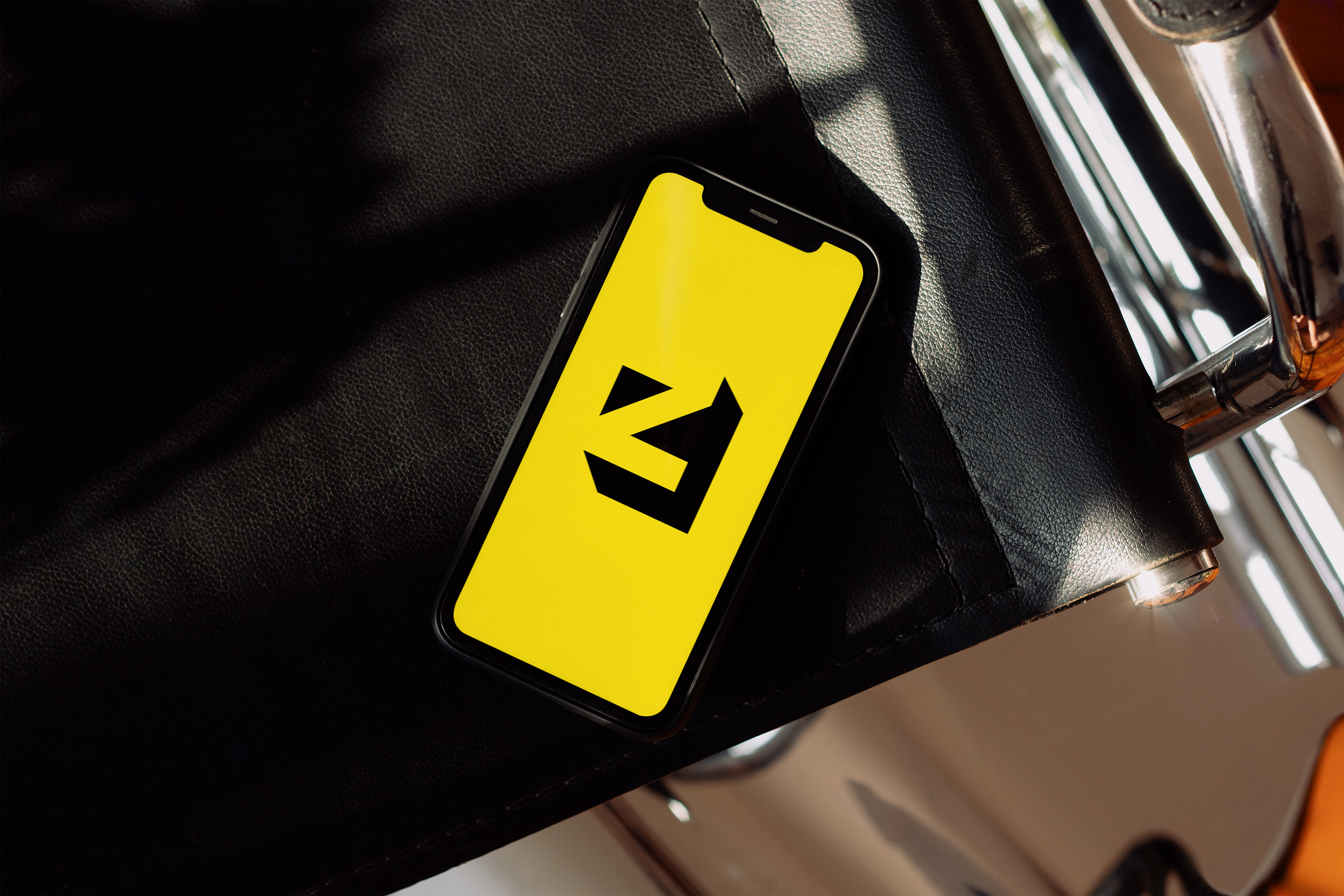
Switching phones, operating systems, or digital ecosystems has become increasingly complex. Users often want to leave an ecosystem, but struggle to understand what they're dependent on, which alternatives exist, and what might break during migration. EZ Switch was designed to help users understand their dependencies and evaluate alternatives based on their own priorities. The project explores how design can reduce uncertainty and transform a technically complex process into a guided experience.
Opportunity:
Create a tool that recommends alternatives based on what users actually care about.

Geometric in nature, the logo simultaneously depicts the letters 'e' and 'z' in the negative space. The drop shadow from the top left forms a triangle in the top left which hints at direction. A reference to the mission for this service. To give customers direction in their choices.

A motion version of the logo sees the triangle spinning. Inspired by a phrase used in the mission for this business "to help people find their direction when considering switching app ecosystems" - the pointer spins to act almost like a compass pointer, to help customers find their direction. This was designed as an asset for loading screens within the app or website.
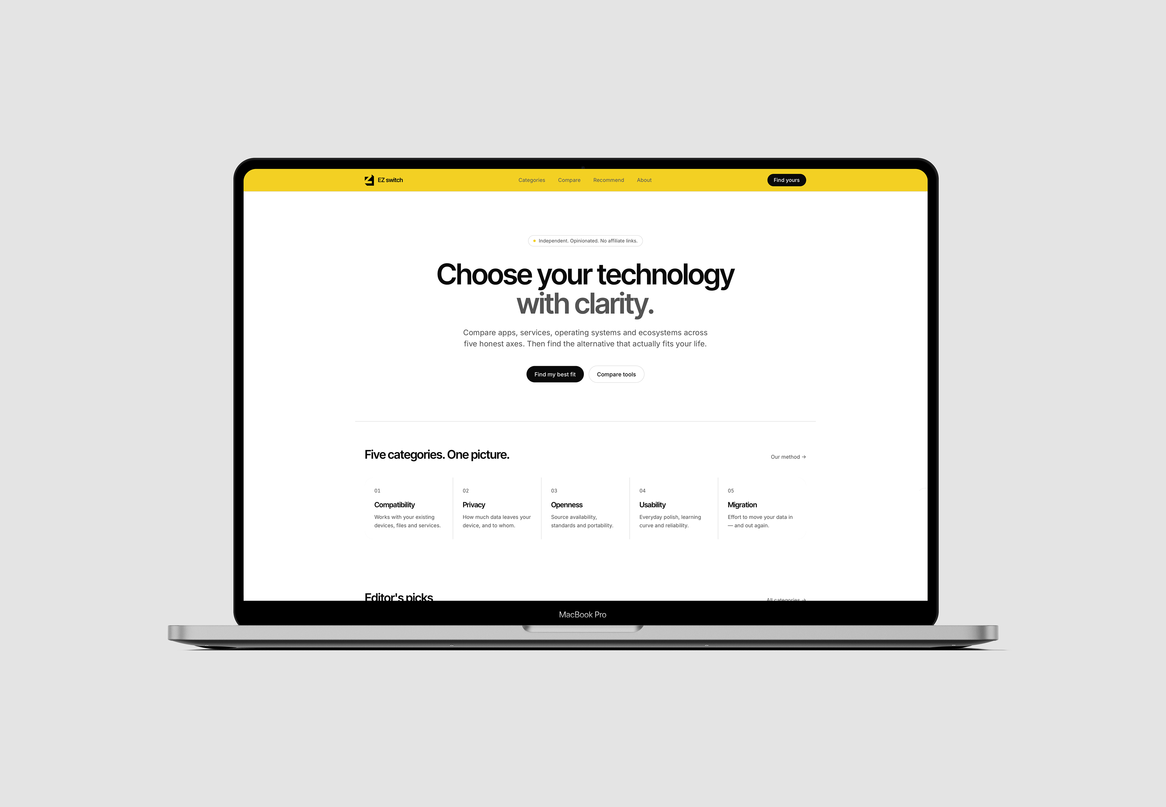
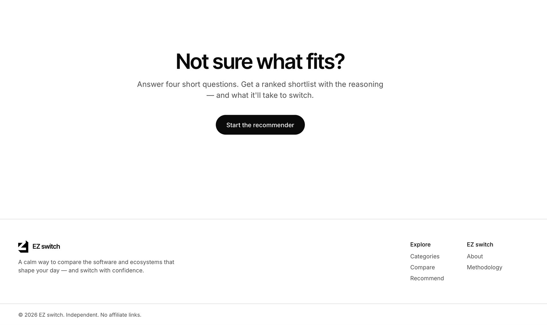
The idea behind EZ Switch was to demonstrate how strategic UX design can simplify complex technical decisions. By focusing on confidence, the product helps users understand their options and make informed decisions about their digital future.
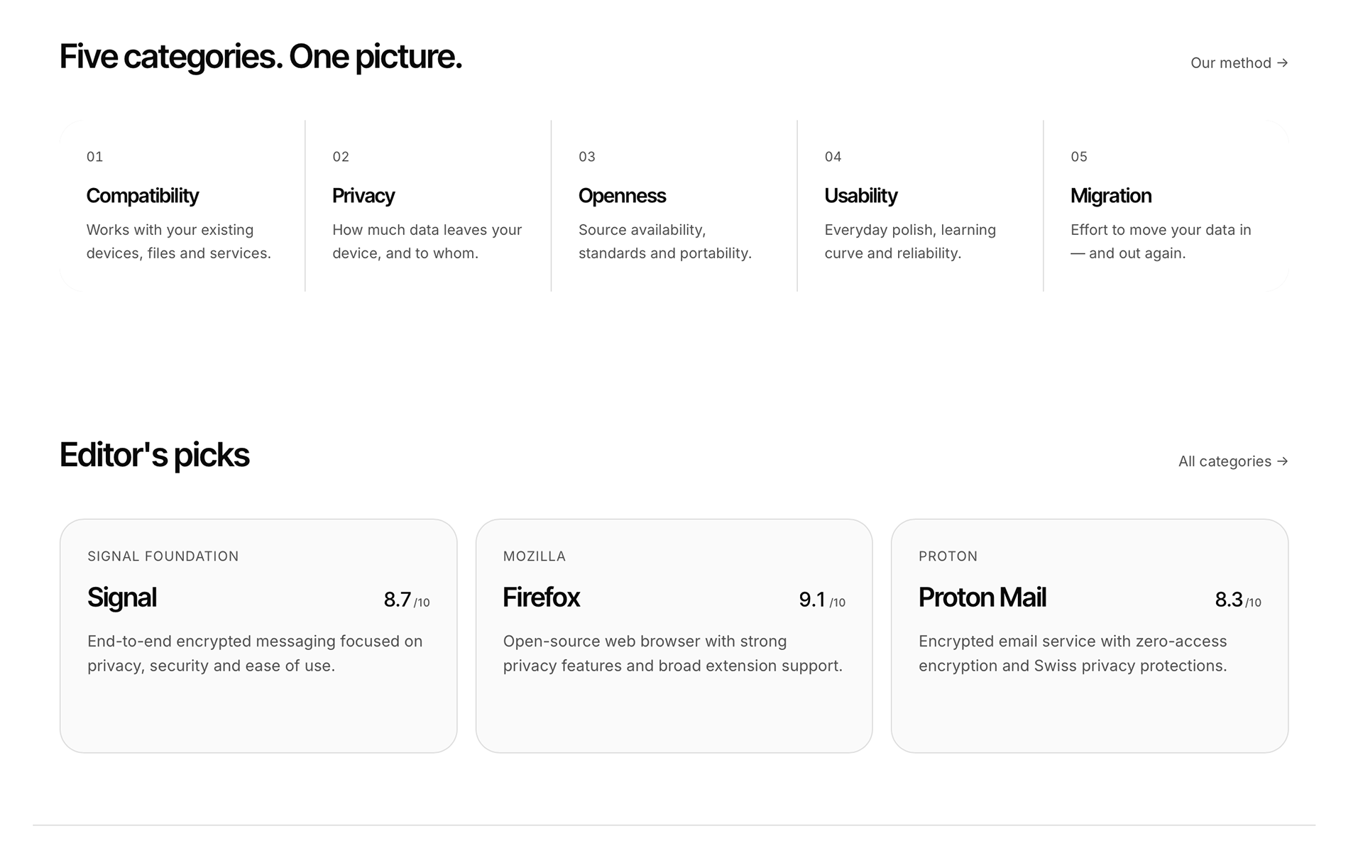
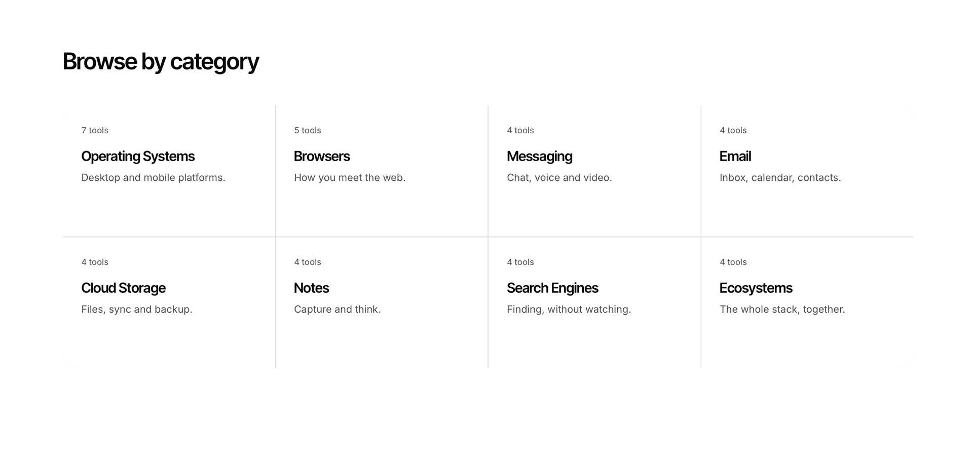
This project reinforced the importance of designing for emotional outcomes rather than functional requirements alone. The most significant insight was recognising that users did not need more information. They needed a clearer path forward. Future iterations would explore live compatibility reporting, community-generated migration data, and expanded ecosystem support.