This self-initiated branding project explores how an athlete's personal story can become the foundation of a memorable visual identity. This is an independent concept project. Not affiliated with or commissioned by Elena Rybakina or her representatives.
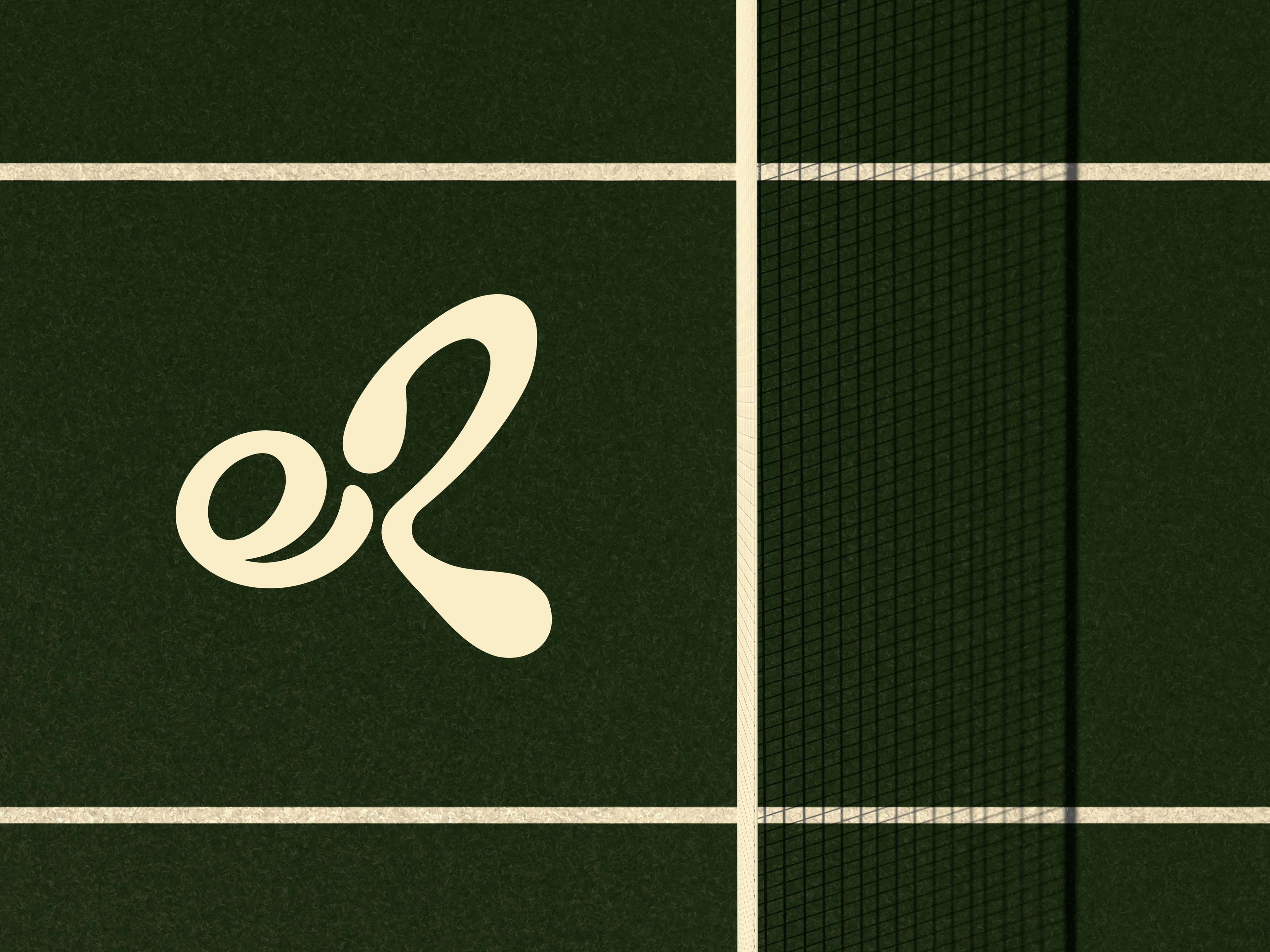
As Elena Rybakina’s profile continues to grow beyond the court, a distinctive visual identity becomes an essential asset. A personal logo creates consistency across apparel, digital platforms, commercial partnerships and future ventures, giving fans and sponsors a recognisable symbol that extends beyond tournament branding.
Elena Rybakina doesn’t rely on spectacle. Her presence is defined by calm, precision and effortless power. This identity translates those qualities into a visual language that is refined, confident and built to last.
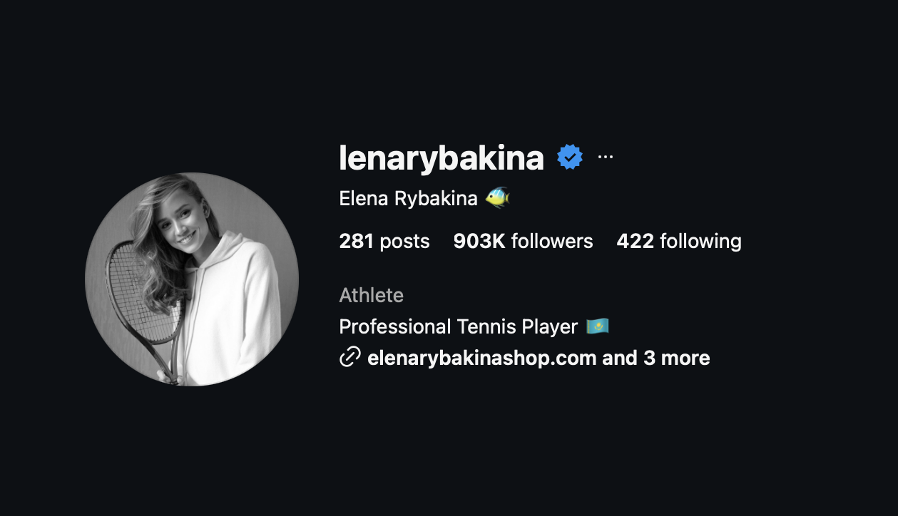
The identity is built around a detail unique to Elena Rybakina. During the research process, I discovered the nickname "Ryba" ("fish" in Russian), which she openly embraces, even using a fish emoji across her social media. Integrating this motif into the monogram creates a mark that extends beyond letterforms, balancing personal significance with universal recognition across linguistic and cultural contexts.
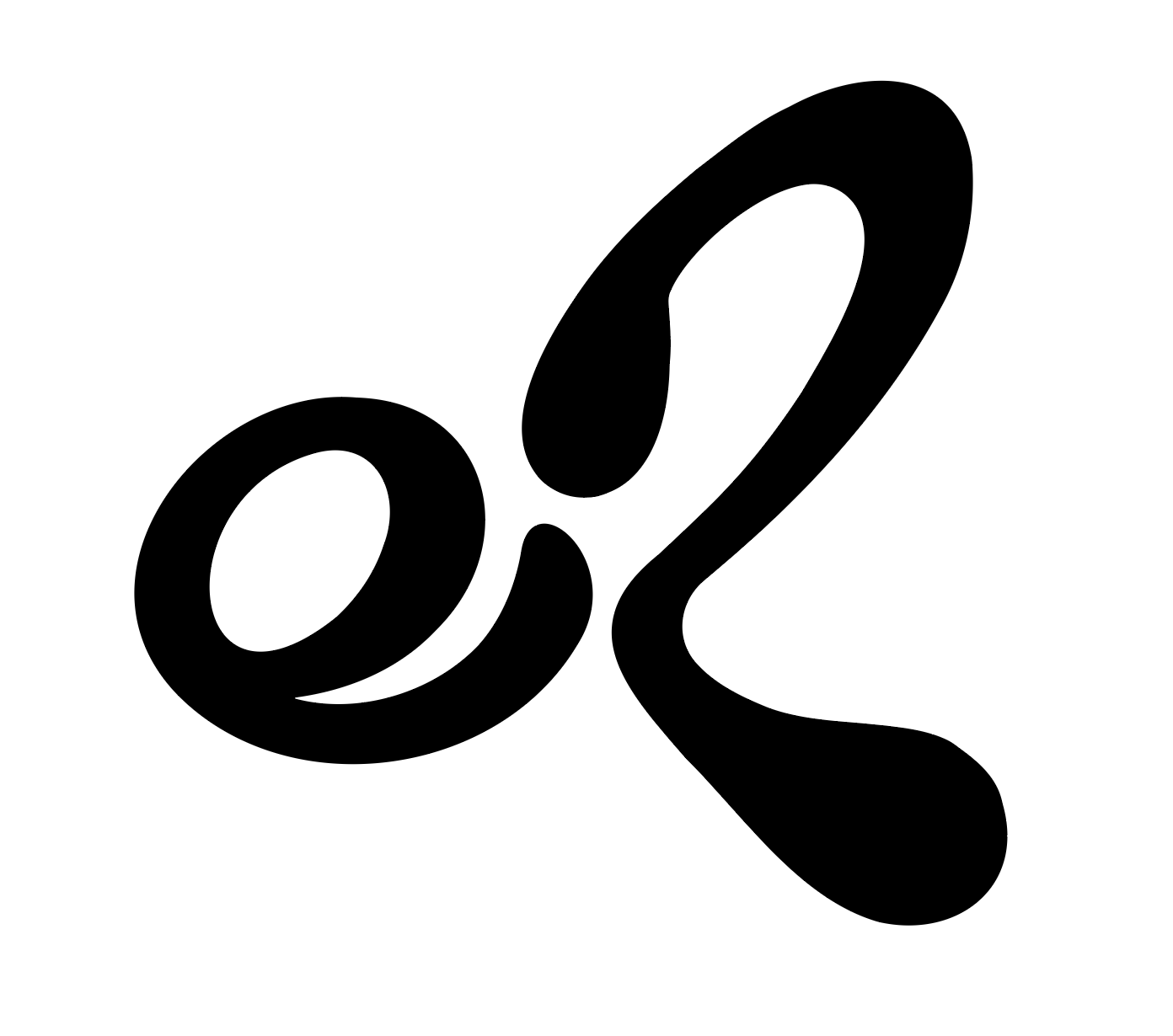
The identity is built from a custom "e" and "R" monogram, abstracted into soft, organic forms that balance legibility with symbolism. Varying stroke widths evoke rhythm and movement, while the rounded terminal of the lowercase "e" and the upper terminal of the "R" are positioned with deliberate spacing, encouraging the eye to move seamlessly between the two letterforms. This visual connection allows the initials to be perceived not only as separate characters, but also flow, as a unified shape.
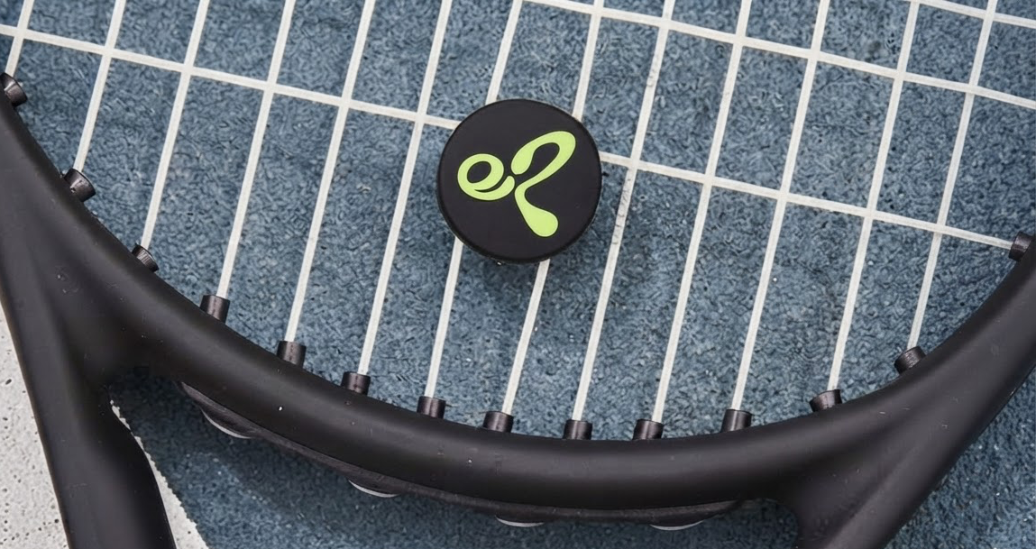
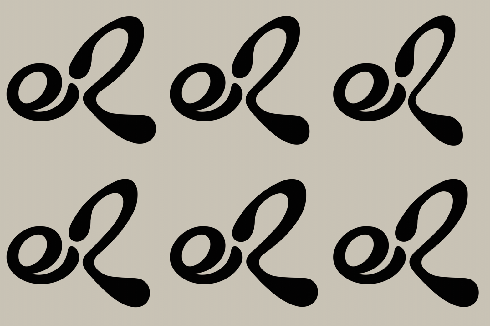
Monogram in motion. A more overt demonstration of the logo concept.

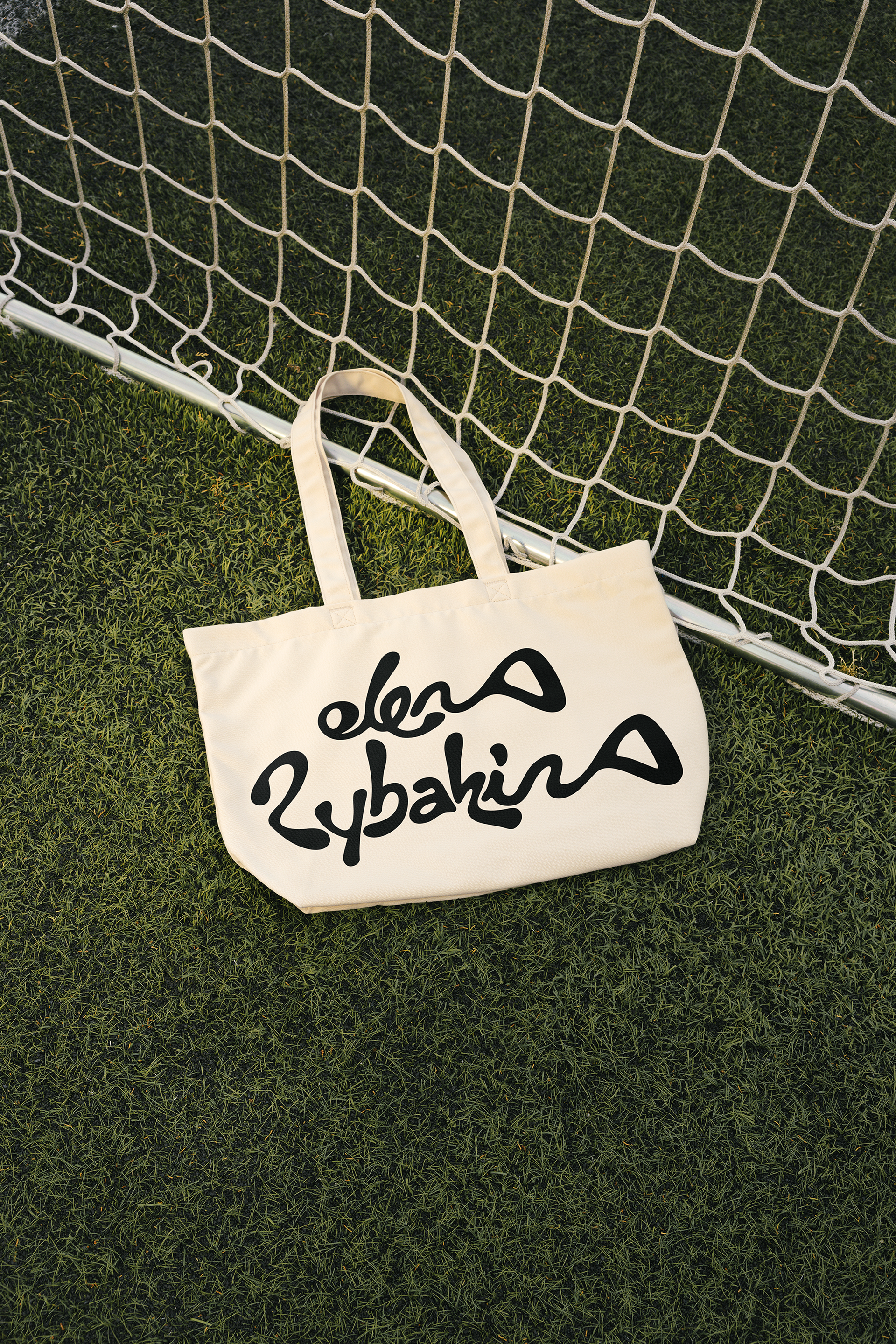
The ER monogram evolved from an initial typographic exploration that sought to integrate Elena's full first name into the silhouette of a fish. As the concept developed, the idea was distilled into a more concise and versatile monogram. However the original wordmark retained enough character to stand alongside the symbol, becoming a complementary expression of the same underlying concept.
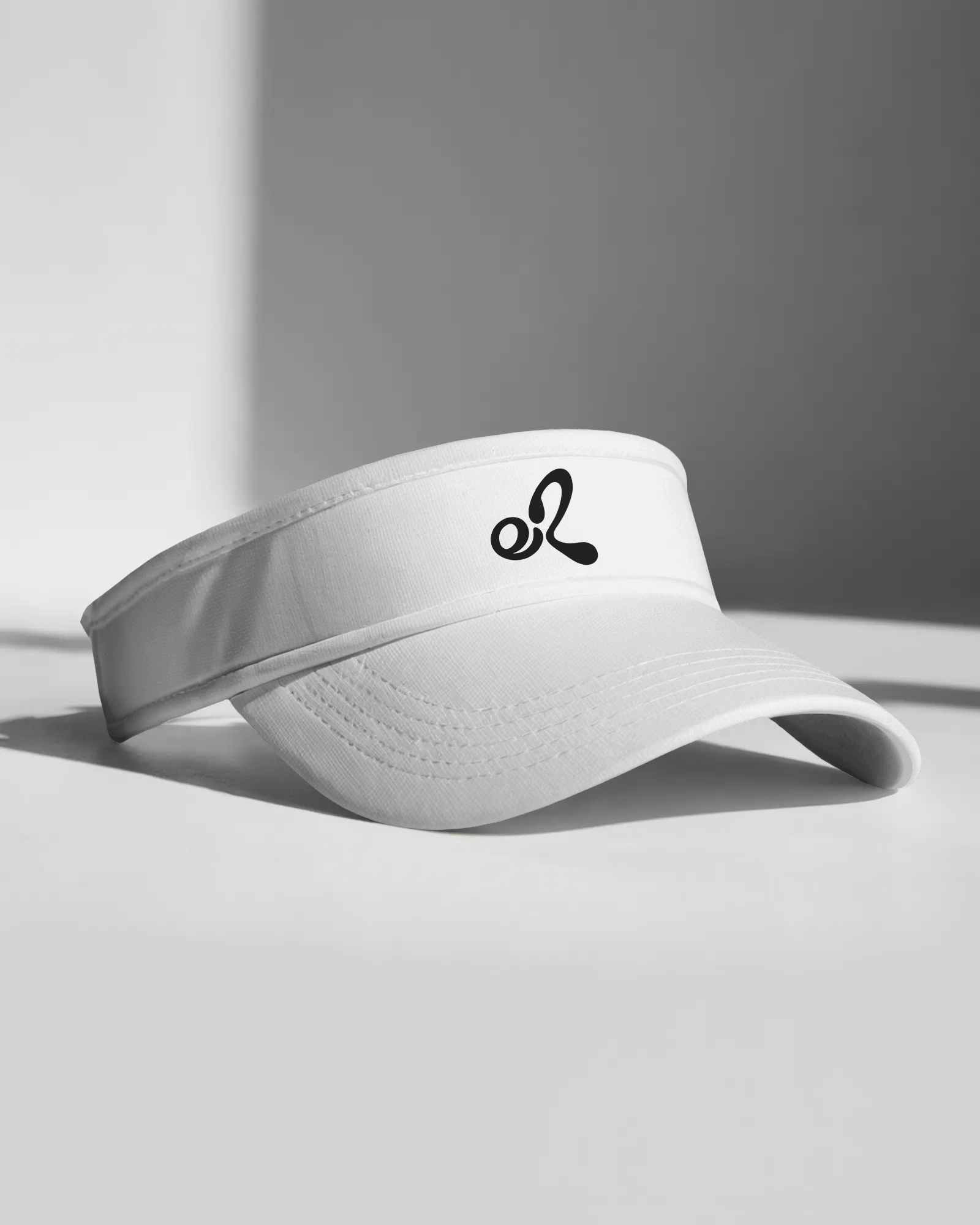

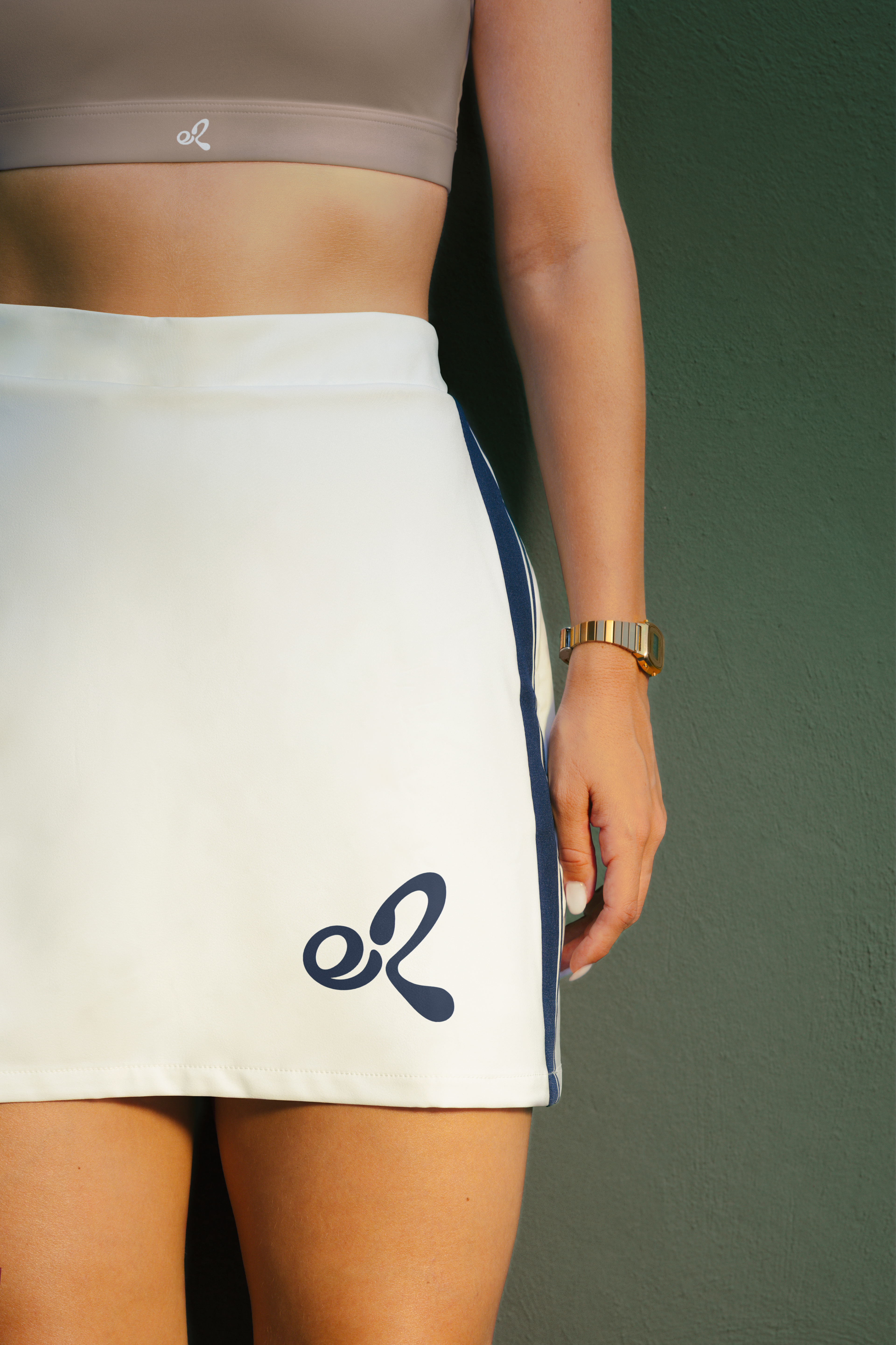
The ER monogram balances creating a distinctive, versatile, personal logo and establishing a symbol that can be recognised beyond any single linguistic context. By combining letterforms with visual symbolism, the mark creates multiple points of connection while remaining concise and memorable.
What began as a typographic exploration ultimately evolved into a flexible identity system that demonstrates how meaning can be embedded into form without sacrificing clarity, scalability, or visual impact.