A modern diving and marine education platform.
The challenge was to develop a symbol that could function equally well across education and certification materials, digital products, apparel, and physical environments.
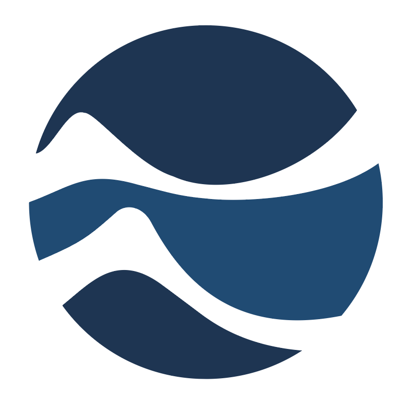
The logo was made to simultaneously evoke scuba diving fins and wave forms. This ambiguity was done intentionally to engage the viewer allowing room for interpretation. The white parts seen in the version of the logo are negative space. Therefore the fins/wave forms will reveal the background on any surface or image the mark is placed. This was done to evoke the philosophy of being at one with the environment. This versatility adds complication to the application of the logo however and careful consideration must be taken when applying this mark to avoid colour clashes.
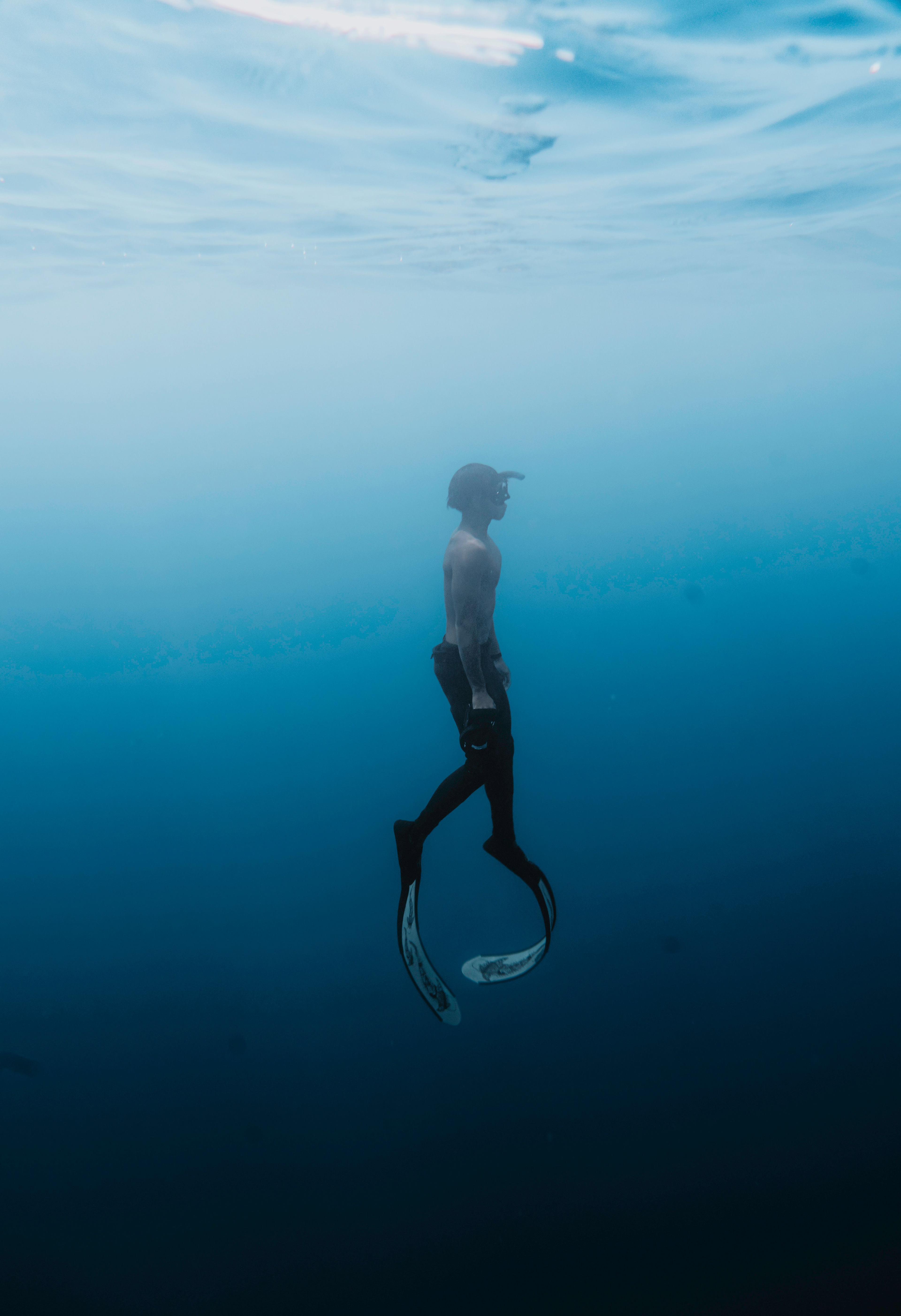
The symbol combines the profile of scuba fins with the rhythm of ocean waves. Rather than depicting diving literally, the mark abstracts the relationship between movement and environment. The circular structure creates a contained system that feels credible, professional, and globally scalable while the flowing internal forms communicate exploration, progress, and fluidity.
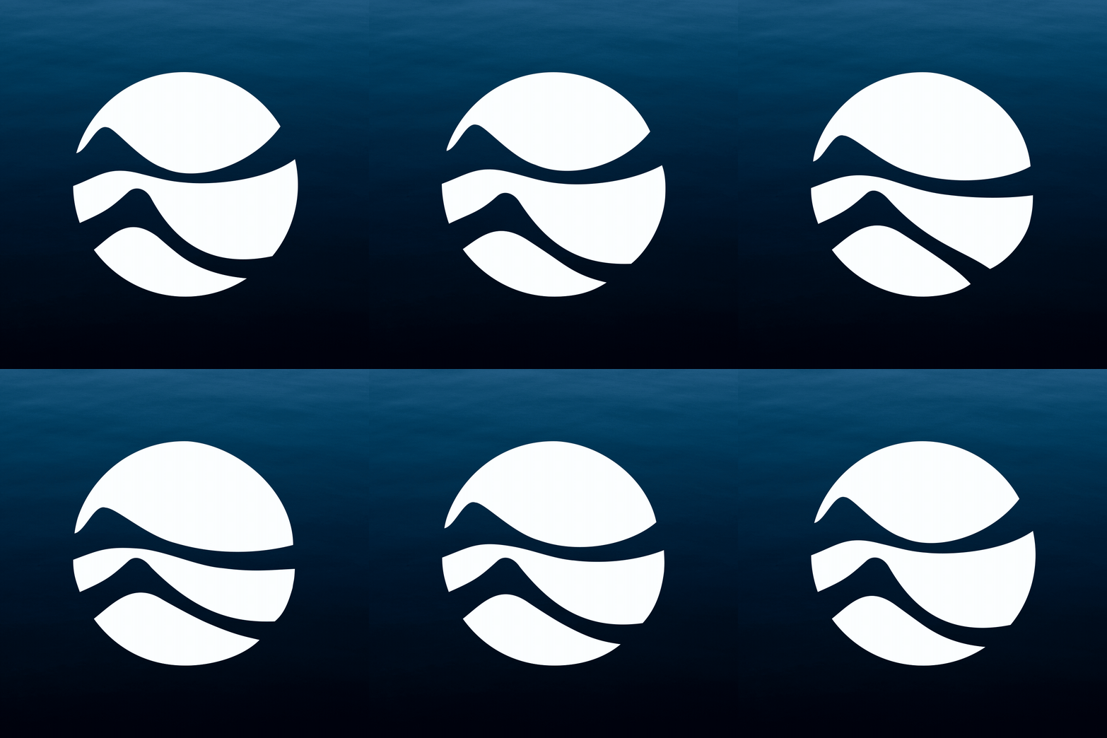
Every dive is a conversation between human movement and ocean movement. The identity captures this relationship through a symbol formed from two interconnected shapes: ocean swells and diving fins. As the forms interact, the boundary between diver and environment begins to disappear, reflecting the immersive nature of the underwater experience.
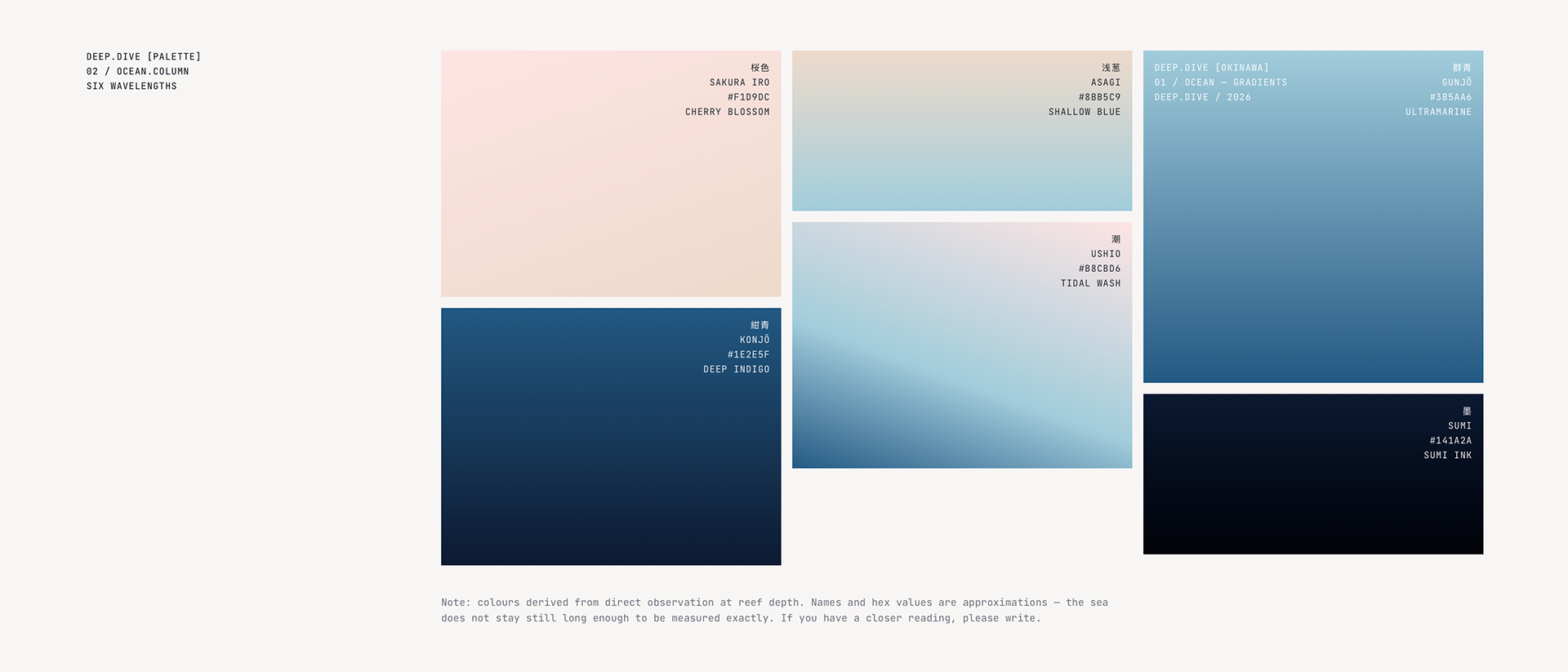
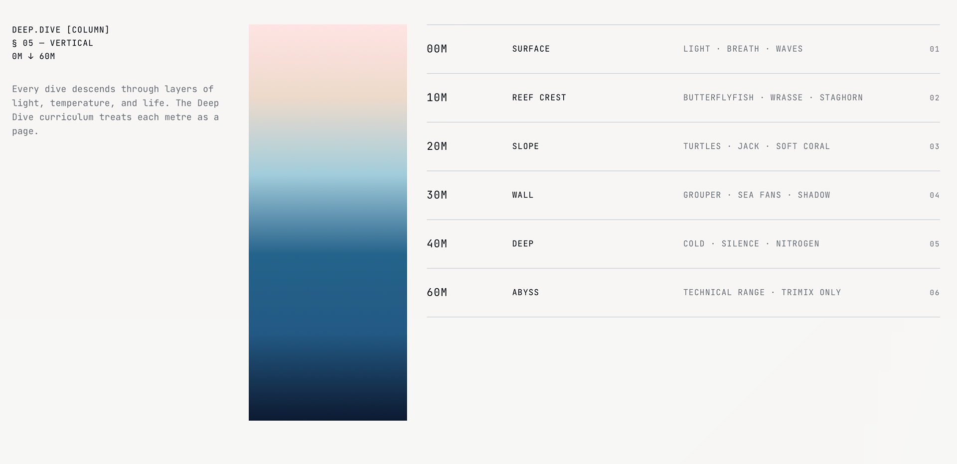
Colour system: Gradients derived from changing light conditions experienced during descent. The further you dive into the course, the darker the gradient.
Typeface: JetBrains Mono - used throughout the identity and sitewide.
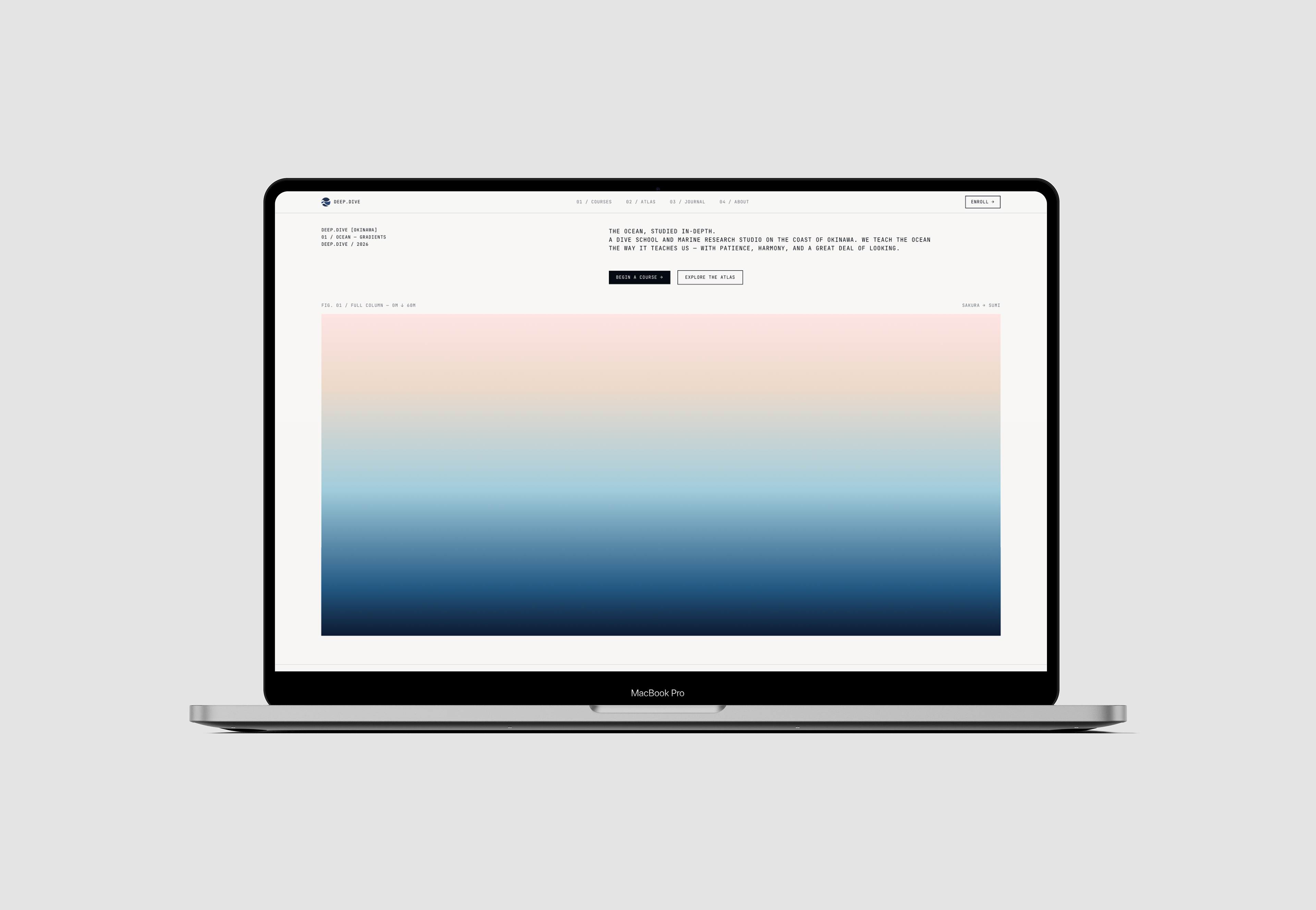
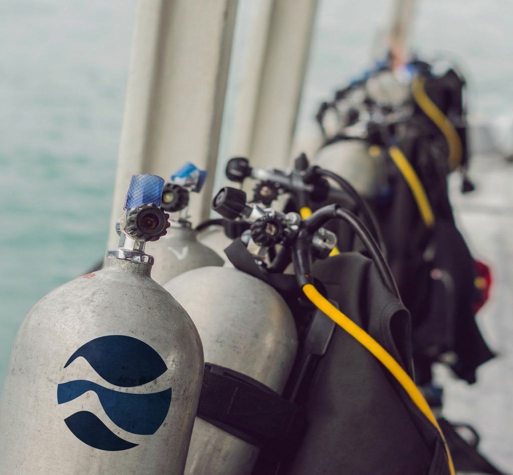
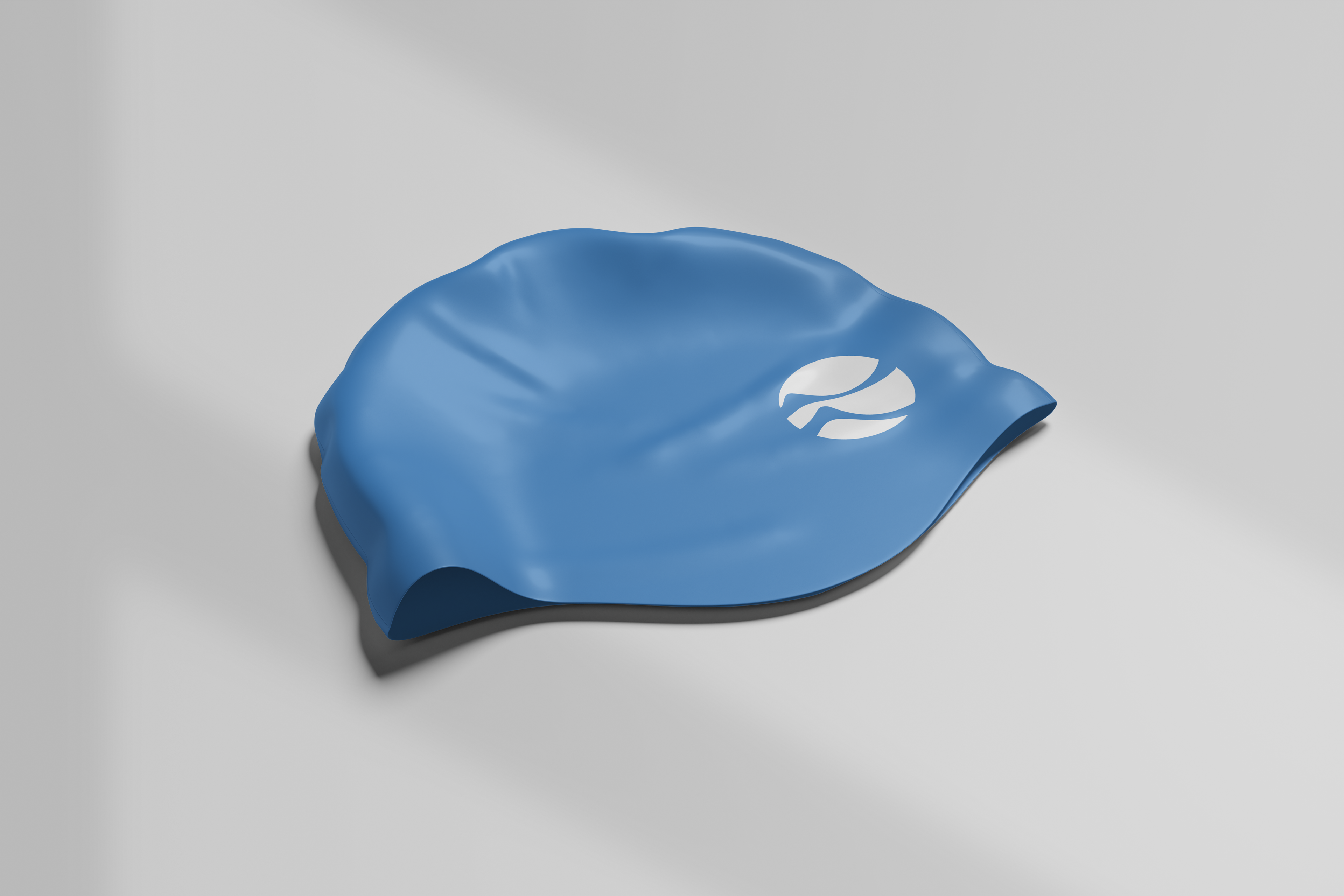
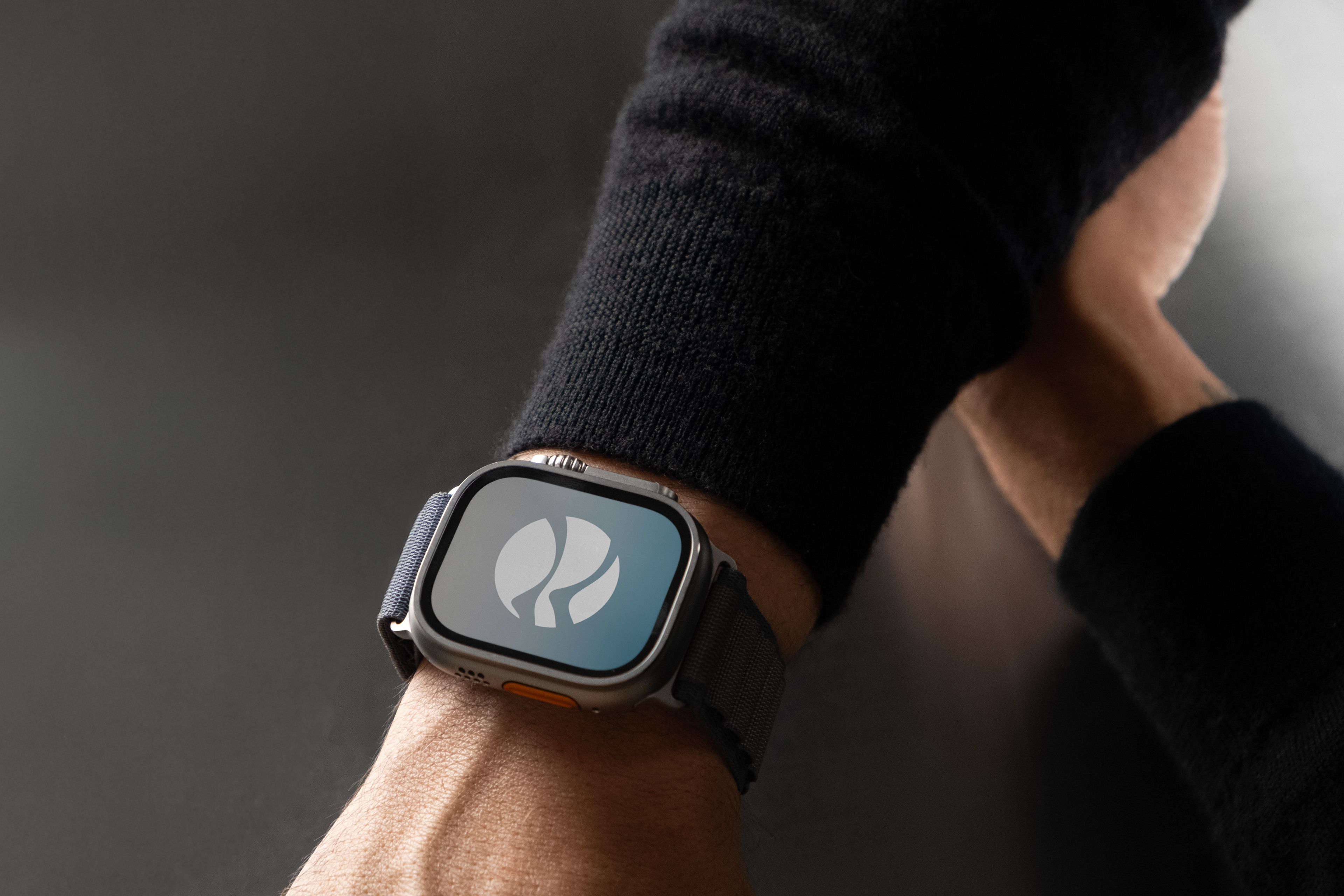
A modern diving identity built around organic shapes. By combining the forms of scuba fins and waves into a single symbol, the brand establishes a distinctive visual foundation that scales consistently across physical and digital touch-points.